Launch & Embed Change
Global Hospitality Group Culture Transformation Programme.
A multi-asset campaign activation reaching 8,000 global colleagues to embed the group's ELEVATE performance mindset


For nearly two decades we were The Smarty Train. In that time the business had changed far more than the name.
We now work with global organisations across three service lines, diagnosing and benchmarking, launching and embedding change, and developing and upskilling people, yet our brand still told the story of a training provider.
Our materials had drifted too: different decks, fonts and formats depending on who made them, and a website and content spread across several old domains.
We needed a brand that matched the work and kept the warmth and wit our clients know us for. And, like every change we design for clients, it had to stick inside the business, not just on the homepage.
We became our own client.
Rather than treat the rebrand as a logo change, we ran it the way we run any change programme: shape the story, launch it, cascade it, embed it.
That meant writing the narrative before designing anything, then building the name, words, visual identity and communications from that one story. And it meant rebuilding the place most people meet us, our website, so the new brand had somewhere to live from day one.





Shape the story. Like a narrative deck for a leadership team, we started with why, what, how and the ask: why the brand had to change, what we stand for, how we work and what we want clients to do next. Everything else was built from that story.
Find the words. We wrote the name, line and voice the way we write programme copy: short, human and built to be remembered. The Smarty Train became TST, and our promise became three words: Designed to stick.
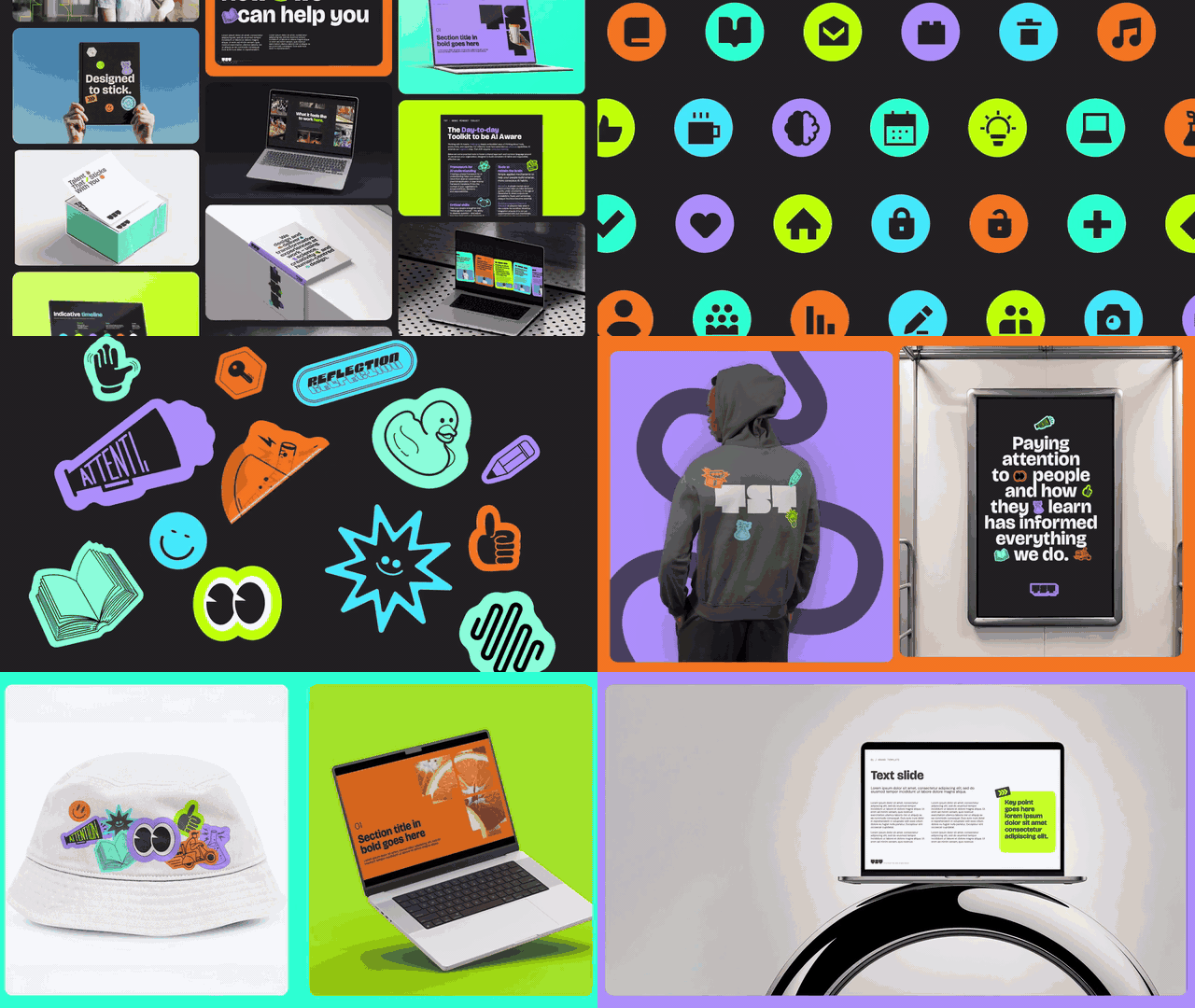
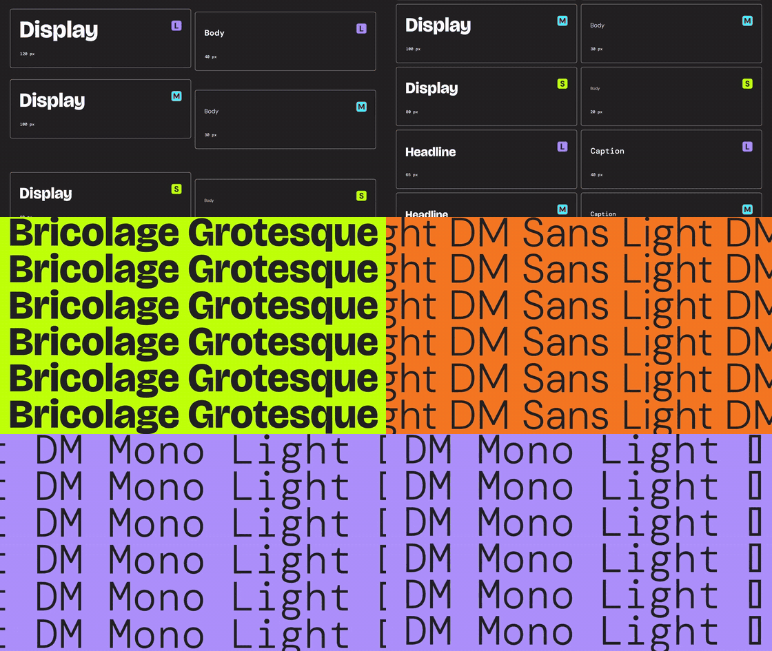
Build the look and feel. One visual system for every touchpoint: black and white as the foundation, five bright accents used only as highlights, Bricolage Grotesque, DM Sans and DM Mono, a library of hand-drawn stickers and photography carrying the TST logo pattern.
Each service line has its own colour, so people can see where they are at a glance.
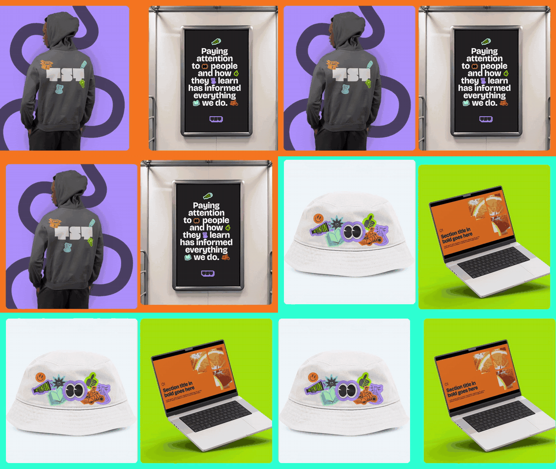
Launch it and embed it. We treated the launch as the start of a campaign, not the end of a project, and gave our own people templates and assets to carry the brand in their everyday work.
And so, TST was born: A new site at wearetst.com, a brand film, and a launch that reached far beyond the homepage. Every case study was rebuilt in the new look. Our articles, toolkits, reports and webinars came together in one insights library. ECO and our HIVE community for Early Careers leaders got homes of their own, and the whole team moved onto Our people. New social handles and email signatures took the brand into every feed and inbox, and every old link was redirected, so nothing a client had saved was lost.


Launching something that needs to look and feel like it matters?
A multi-asset campaign activation reaching 8,000 global colleagues to embed the group's ELEVATE performance mindset
A skills-led recruitment strategy and multi-asset digital campaign to help global early careers candidates self-select into the right roles
